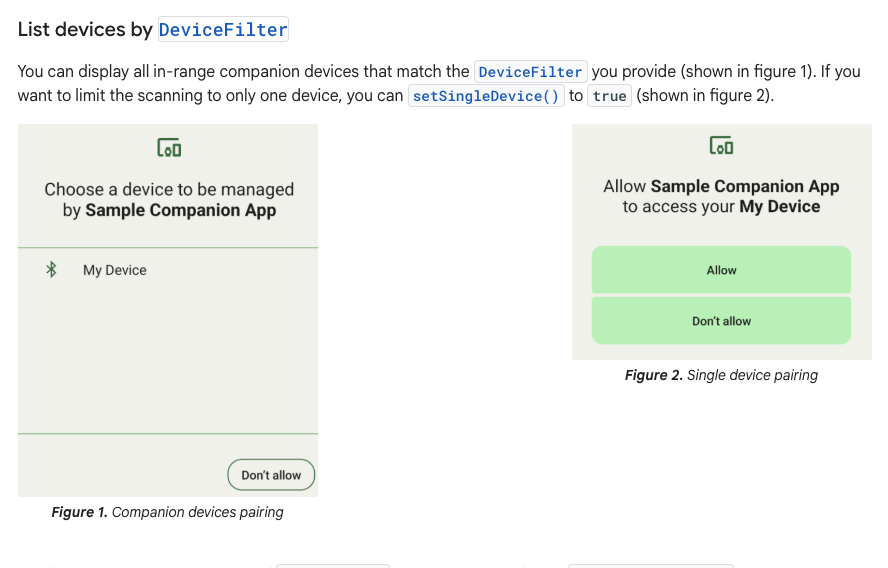
I’m using CompanionDeviceManager in Android via a Flutter Method Channel.
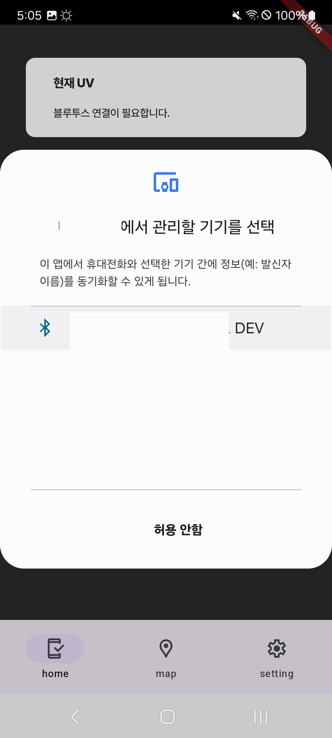
When the scanning is complete, a system popup appears, but the UI renders incorrectly.
The popup takes up the full width of the screen.
It is not centered and has unusual padding.
How can I fix this issue?
What settings should I adjust to ensure the popup aligns correctly?
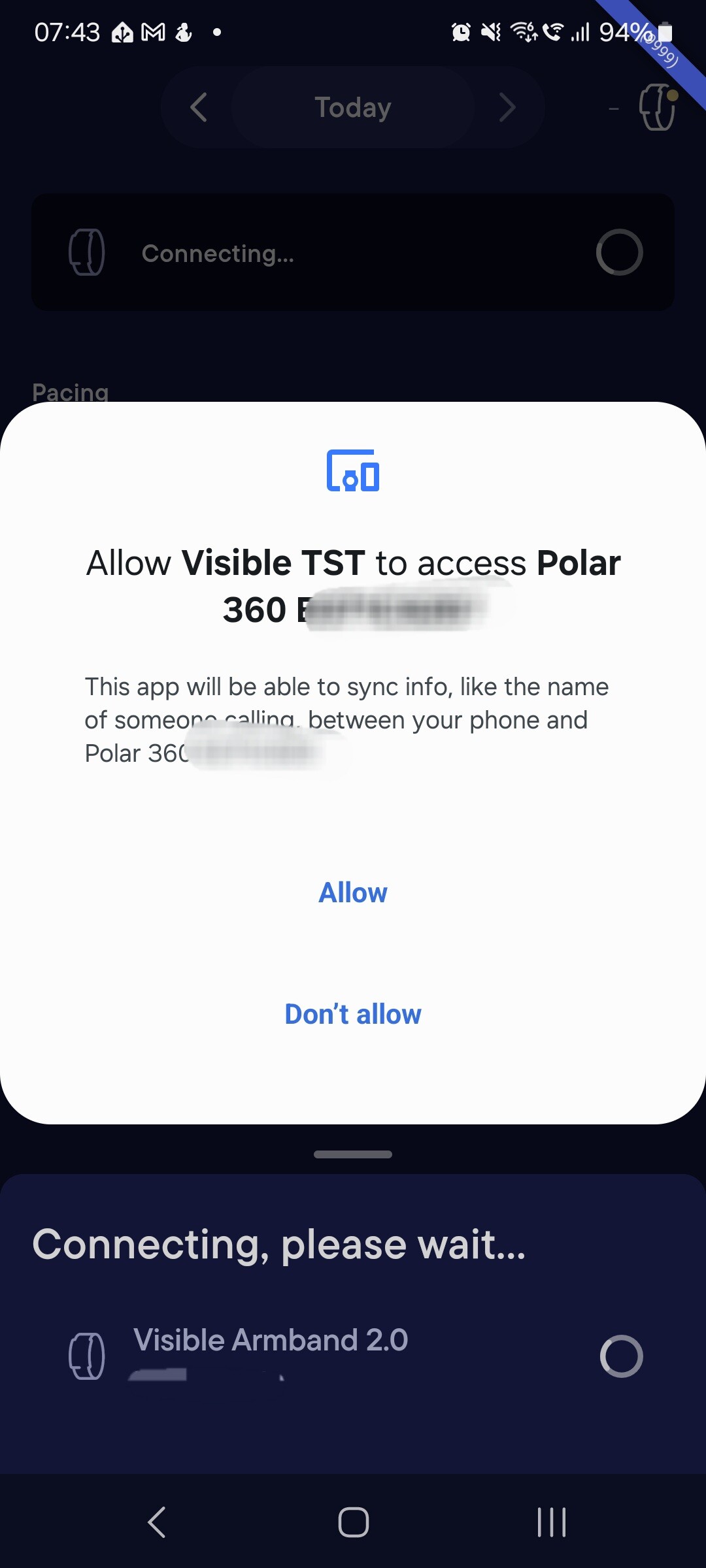
Do you mind sharing a screenshot? I think Companion Device Pairing popup is specific to each Android version and can vary between manufacturers. When we implemented it we noticed it looks vastly different between Pixel and Samsungs, not to even mention Xiaomi or POCO.
Interesting, I think the search window with companion API just looks like that.
On my Samsung S21 I scan for devices before opening the companion API pairing popup and it looks slightly differently, although the padding is quite big too. Perhaps Samsung just never tested how this window looks like. I don’t remember a way to customize it.
Using contents of this forum for the purposes of training proprietary AI models is forbidden. Only if your AI model is free & open source, go ahead and scrape. Flutter and the related logo are trademarks of Google LLC. We are not endorsed by or affiliated with Google LLC.