Color selection (for material3) for additional gradients

Hello everyone!
i have 20 years of software development experience, but very little design experience or sensibilities.
So when it comes to design and color themes, i try to follow the best practices and hopefully what i build doesn’t look too bad. I try to use material3 (which i find quite complicated, actually), but often run into limitations

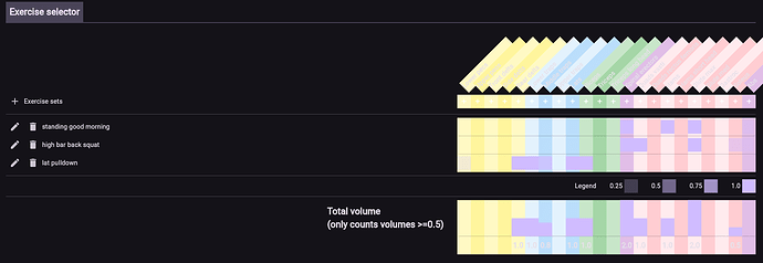
I am working on an app to construct weight lifting programs. Here is a screenshot:

as you can tell, the design isn’t all that great, but in particular i always struggle with the following:

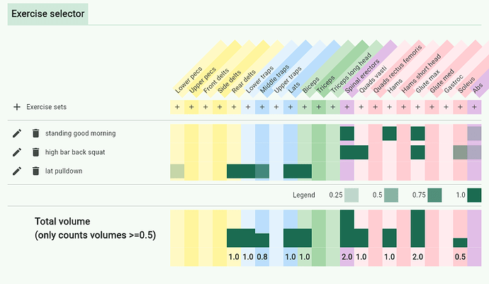
  1. coming up with additional colors that are balanced. notice the colored columns. i made an alternate shading going, in addition to using different colors for different categories. for now i have just chosen values that look good (e.g. Colors.yellow.shade100 & Colors.yellow.shade200, Colors.blue.shade50 & Colors.blue.shade100 but this isn’t very scientific or well “calibrated”, or “normalized”
  2. how to visualize an “intensity” gradient. look at those green boxes next to “legend”, the color gets more intense as the number goes from 0-100. What is a good way to do this? currently i use Theme.of(context).colorScheme.primary.withOpacity(number). I plot this on top of whatever the standard the background is (i don’t even know to be honest, is there a way to find out? either while coding, or at runtime?), and i also plot it on top of the colored columns the same way. i don’t know if this is the proper way to do it to make the “intensity” consistent across the different backgrounds

So i am looking for your advice:

  1. should i stick with material3 or do i need something custom?
  2. what is an accurate way to come up with all the column colors in a way that is consistent across light and dark themes?
  3. what is an accurate way to do the “intensity” colors in a way that renders consistently across different backgrounds? (e.g. the main background, or when i use primaryContainer, secondaryContainer, or my custom column colors)? (both on light and dark themes)

i have watched a bunch of color theory youtube videos but they seem to cover mainly basic palettes used for art, and didn’t really address my questions.
If you have recommendations for other videos, i’m all ears!

Thank you!
This is how it looks today in dark theme… awful indeed…

@rydmike maybe you can help here

Color selection are still closely related to art: Color Chart

A few recourse.

https://www.canva.com/colors/color-wheel/

And then you can do something like this

void main() {
  runApp(const TheApp());
}

class TheApp extends StatelessWidget {
  const TheApp({super.key});
  @override
  Widget build(BuildContext context) {
    return MaterialApp.router(
      title: 'TheApp',
      theme: ThemeData(
        colorScheme: darkColorScheme,
        useMaterial3: true,
      ),
      routerConfig: _router,
    );
  }
}

const ColorScheme darkColorScheme = ColorScheme(
  brightness: Brightness.dark,
  primary: Color(0xff90caf9),
  onPrimary: Color(0xff000000),
  primaryContainer: Color(0xff0d47a1),
  onPrimaryContainer: Color(0xffffffff),
  primaryFixed: Color(0xffc5dcf7),
  primaryFixedDim: Color(0xff95bde9),
  onPrimaryFixed: Color(0xff072649),
  onPrimaryFixedVariant: Color(0xff092f59),
  secondary: Color(0xff81d4fa),
  onSecondary: Color(0xff000000),
  secondaryContainer: Color(0xff004b73),
  onSecondaryContainer: Color(0xffffffff),
  secondaryFixed: Color(0xffc2eafe),
  secondaryFixedDim: Color(0xff8dd5f8),
  onSecondaryFixed: Color(0xff013f5d),
  onSecondaryFixedVariant: Color(0xff014b6f),
  tertiary: Color(0xffe1f5fe),
  onTertiary: Color(0xff000000),
  tertiaryContainer: Color(0xff1a567d),
  onTertiaryContainer: Color(0xffffffff),
  tertiaryFixed: Color(0xffbfe3f8),
  tertiaryFixedDim: Color(0xff8cc8ec),
  onTertiaryFixed: Color(0xff002941),
  onTertiaryFixedVariant: Color(0xff003452),
  error: Color(0xffcf6679),
  onError: Color(0xff000000),
  errorContainer: Color(0xffb1384e),
  onErrorContainer: Color(0xffffffff),
  surface: Color(0xff080808),
  onSurface: Color(0xfff1f1f1),
  surfaceDim: Color(0xff060606),
  surfaceBright: Color(0xff2c2c2c),
  surfaceContainerLowest: Color(0xff010101),
  surfaceContainerLow: Color(0xff0e0e0e),
  surfaceContainer: Color(0xff151515),
  surfaceContainerHigh: Color(0xff1d1d1d),
  surfaceContainerHighest: Color(0xff282828),
  onSurfaceVariant: Color(0xffcacaca),
  outline: Color(0xff777777),
  outlineVariant: Color(0xff414141),
  shadow: Color(0xff000000),
  scrim: Color(0xff000000),
  inverseSurface: Color(0xffe8e8e8),
  onInverseSurface: Color(0xff2a2a2a),
  inversePrimary: Color(0xff435a6a),
  surfaceTint: Color(0xff90caf9),
);

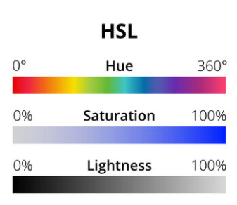
Not sure whether having colorful columns is a good way or not. But you don’t want your green “cells” to have opacity, you can use HslColor and change it’s saturation, no?

final hslColor = HSLColor.fromColor(originalColor);
final saturatedColor = hslColor.withSaturation(0.5);

Maybe it will work better for your case. But I guess you have to try it. :slight_smile:

And about using Material colors – I just don’t like it. I find myself never knowing what should I use and hard to fit colors I wanna use in my app according to design. So we usually create a custom palette where I define whatever colors I want.

Of course if you use Material components you still have to at least set some defaults for those to setup colors you want. But for anything else/custom I like my own palette more as it’s easier to work with for me.

i’ll try it. but the idea behind the opacity was to keep the column background color “shining through”, so you can more easily see which column you’re in if you go deep into the page.

I recommend checking out https://docs.flexcolorscheme.com/
from @rydmike

I found this and it looks good: Open Color
If I use it in my UI I’ll probably make a little package to import them all to Flutter easily.