I’ve defined a simple theme and am trying to use it, but it seems the default is being used. How do I ensure that the theme I specify (based on light blue) is used rather than the built-in purple default? This app
import 'package:flutter/material.dart';

void main() {
  runApp(ExampleApp());
}

class ExampleApp extends StatelessWidget {
  @override
  Widget build(BuildContext context) {
    return MaterialApp(
      debugShowCheckedModeBanner: false,
      theme: ThemeData(
        colorScheme: ColorScheme.fromSeed(seedColor: Colors.lightBlue),
        textTheme: TextTheme(
          displayLarge: const TextStyle(
            fontSize: 72,
            fontWeight: FontWeight.bold,
          ),
        ),
      ),
      home: Scaffold(
        appBar: AppBar(
          backgroundColor: Theme.of(context).colorScheme.inversePrimary,
          title: Text('My Spiffy App'),
        ),
        body: ElevatedButton(
          onPressed: () {},
          style: ElevatedButton.styleFrom(
            backgroundColor: Theme.of(context).colorScheme.primary,
            foregroundColor: Colors.white, // text color
            shape: RoundedRectangleBorder(
              borderRadius: BorderRadius.circular(8),
            ),
          ),
          child: Text('My Spiffy Button', style: TextStyle(fontSize: 18)),
        ),
      ),
    );
  }
}
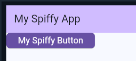
gives the rendering
I guess it’s because it’s using the context passed to the
build method, so what’s the best way to restructure things to get the light blue theme from the get-go?