Hello everyone,
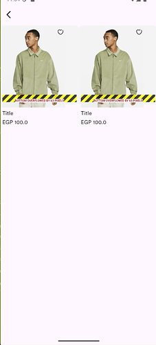
I’m facing an overflow issue when displaying items inside a GridView in Flutter. I have created a custom Item widget for displaying products in the CategoryScreen, but when I run the app, I get an “A RenderFlex overflowed” error.
Here is my Item widget code:
import 'package:flutter/material.dart';
import 'package:flutter_screenutil/flutter_screenutil.dart';
import 'package:flutter_svg/flutter_svg.dart';
import 'package:super_mall/core/theme/app_color/app_color_light.dart';

class Item extends StatelessWidget {
  final String path;
  final String title;
  final double price;

  const Item({
    super.key,
    required this.path,
    required this.title,
    required this.price,
  });

  @override
  Widget build(BuildContext context) {
    return Container(
      padding: EdgeInsets.all(5.r),
      constraints: BoxConstraints(
        minHeight: 220.h,
      ),
      decoration: BoxDecoration(
        borderRadius: BorderRadius.circular(10.r),
        color: AppColorLight.grey1,
      ),
      child: Column(
        crossAxisAlignment: CrossAxisAlignment.start,
        children: [
          Stack(
            children: [
              SizedBox(
                child: Image.asset(
                  height: 190.w,
                  width: 150.w,
                  path,
                  fit: BoxFit.fitHeight,
                ),
              ),
              Positioned(
                right: 0,
                top: 0,
                child: SvgPicture.asset(
                  'assets/vectors/fav-icon.svg',
                ),
              ),
            ],
          ),
          SizedBox(height: 5.h),
          Text(
            title,
            overflow: TextOverflow.ellipsis,
          ),
          SizedBox(height: 3.h),
          Text('EGP $price'),
        ],
      ),
    );
  }
}
And here is the CategoryScreen where I display the items inside a GridView:
import 'package:flutter/material.dart';
import 'package:super_mall/shared/widget/appbar_back_title.dart';
import 'package:super_mall/shared/widget/item.dart';

class CategoryScreen extends StatelessWidget {
  const CategoryScreen({super.key});

  @override
  Widget build(BuildContext context) {
    return Scaffold(
      appBar: AppbarBackTitle(),
      body: GridView(
        gridDelegate: SliverGridDelegateWithFixedCrossAxisCount(
          crossAxisCount: 2,
        ),
        children: [
          Item(path: 'assets/images/example1.png', title: 'Title', price: 100),
          Item(path: 'assets/images/example1.png', title: 'Title', price: 100),
        ],
      ),
    );
  }
}
Issue:
- When rendering the items inside
GridView, I get an overflow error. - I suspect that the height of the
Itemwidget is exceeding the available space inside the grid cells.
What I’ve Tried:
- Wrapping the
Itemwidget inside anExpandedorFlexiblewidget. - Using
IntrinsicHeightto adjust the height dynamically. - Modifying
BoxConstraintsbut still getting the issue.
What would be the best approach to make sure each grid item fits properly without causing an overflow? Any help would be appreciated!
