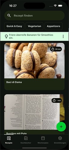
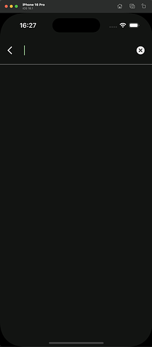
Is there a way to set a BorderRadius and fill color for the TextField in the focus state? I haven’t found a possibility yet.
Do you mean the SearchAnchor.bar?
If so, it comes with a number of MaterialStateProperties (WidgetlStateProperties) that allows you to control them on widget level for the different states like focus, hover, etc. It has separate properties for the search bar and and the opened search view tied to it.
  factory SearchAnchor.bar({
    Widget? barLeading,
    Iterable<Widget>? barTrailing,
    String? barHintText,
    GestureTapCallback? onTap,
    ValueChanged<String>? onSubmitted,
    ValueChanged<String>? onChanged,
    MaterialStateProperty<double?>? barElevation,
    MaterialStateProperty<Color?>? barBackgroundColor, // THIS one
    MaterialStateProperty<Color?>? barOverlayColor, // THIS one
    MaterialStateProperty<BorderSide?>? barSide,
    MaterialStateProperty<OutlinedBorder?>? barShape, // THIS One
    MaterialStateProperty<EdgeInsetsGeometry?>? barPadding,
    MaterialStateProperty<TextStyle?>? barTextStyle,
    MaterialStateProperty<TextStyle?>? barHintStyle,
    Widget? viewLeading,
    Iterable<Widget>? viewTrailing,
    String? viewHintText,
    Color? viewBackgroundColor, // THIS one for the opened view background
    double? viewElevation,
    BorderSide? viewSide,
    OutlinedBorder? viewShape, // THIS one for opened view shape
    double? viewHeaderHeight,
Did you try them? Was there some issue with them?
Using the MaterialStateProperty (deprecated, now called WidgetStateProperty but SDK has not updated its internal usage yet). Is a bit of pain and has kind of poor dev experience. Let me know if you need som pointers on using them. Although Claude or ChartGPT can usually explain it well too.
If you are looking to doing it with themes, there are two separate component themes that needs to be styled with similar properties.
In ThemeData the properties searchBarTheme and searchViewTheme taking a SearchBarThemeData and SearchViewThemeData respectively, are the ones you want to use to customize their global theme style.
Be aware that giving the search view any shape, will cause the full screen variant of it to use this shape as well. Which is fine if you don’t use the full screen version. This is “bug” or lack of feature of theming widget variants in Flutter’s theming capabilities. For this particular widget I still have it on my to do list to report this issue. If you use widget level properties you don’t have this issue.
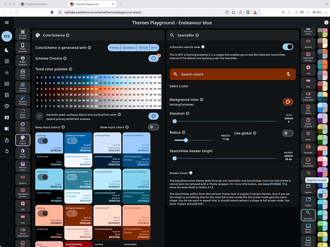
Here is a demo video of using the custom shape and custom background color on SearchAnchor.bar. The Themes Playground does not support assigning different colors for different widget states for these component themes, yet. I might add that later, but the general theming and widget itself do support this.
EDIT: I was going to add a demo video showing it, but I cannot upload videos here, bummer, so just a screenshot then, but it does not really demo it, lol.
Well you can also play with demo config I made here at least: Playground


