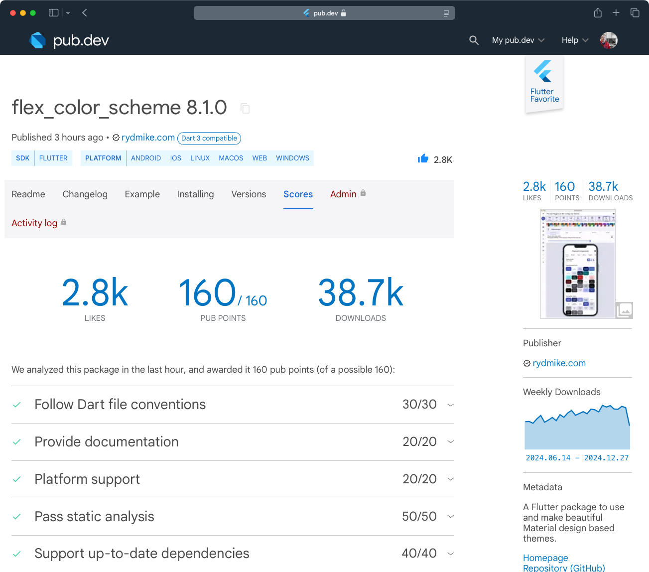
Released #FlexColorScheme 8.1.0, the ultimate flutter Material theming package and #ThemesPlayground tool. Now with #FlutterDev 3.27 and Dart 3.6 updates. Package and Themes Playground
8 Likes
nice! this is one of those problems that we all fight with
1 Like
@rydmike, those color scheme packages of yours are really well done!
I’m trying to figure out how to use colors properly, and I’m a bit stuck.
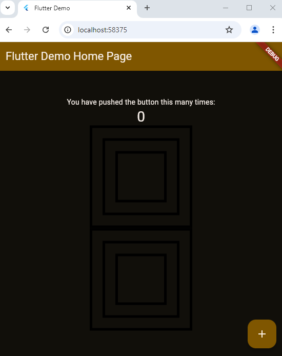
I added some widgets to the “Counter App,” but the colors aren’t doing what I expect. I’m not clear on when onSecondary and primaryFixed colors would be used.
Is there any documentation that goes into more detail about these color roles?
import 'package:flutter/material.dart';

void main() {
  runApp(const MyApp());
}

class MyApp extends StatelessWidget {
  const MyApp({super.key});

  // This widget is the root of your application.
  @override
  Widget build(BuildContext context) {
    return MaterialApp(
      title: 'Flutter Demo',
      theme: ThemeData(
        // This is the theme of your application.
        //
        // TRY THIS: Try running your application with "flutter run". You'll see
        // the application has a purple toolbar. Then, without quitting the app,
        // try changing the seedColor in the colorScheme below to Colors.green
        // and then invoke "hot reload" (save your changes or press the "hot
        // reload" button in a Flutter-supported IDE, or press "r" if you used
        // the command line to start the app).
        //
        // Notice that the counter didn't reset back to zero; the application
        // state is not lost during the reload. To reset the state, use hot
        // restart instead.
        //
        // This works for code too, not just values: Most code changes can be
        // tested with just a hot reload.
        colorScheme: darkColorScheme,
        useMaterial3: true,
      ),
      home: const MyHomePage(title: 'Flutter Demo Home Page'),
    );
  }
}

class MyHomePage extends StatefulWidget {
  const MyHomePage({super.key, required this.title});

  // This widget is the home page of your application. It is stateful, meaning
  // that it has a State object (defined below) that contains fields that affect
  // how it looks.

  // This class is the configuration for the state. It holds the values (in this
  // case the title) provided by the parent (in this case the App widget) and
  // used by the build method of the State. Fields in a Widget subclass are
  // always marked "final".

  final String title;

  @override
  State<MyHomePage> createState() => _MyHomePageState();
}

class _MyHomePageState extends State<MyHomePage> {
  int _counter = 0;

  void _incrementCounter() {
    setState(() {
      // This call to setState tells the Flutter framework that something has
      // changed in this State, which causes it to rerun the build method below
      // so that the display can reflect the updated values. If we changed
      // _counter without calling setState(), then the build method would not be
      // called again, and so nothing would appear to happen.
      _counter++;
    });
  }

  @override
  Widget build(BuildContext context) {
    // This method is rerun every time setState is called, for instance as done
    // by the _incrementCounter method above.
    //
    // The Flutter framework has been optimized to make rerunning build methods
    // fast, so that you can just rebuild anything that needs updating rather
    // than having to individually change instances of widgets.
    return Scaffold(
      appBar: AppBar(
        // TRY THIS: Try changing the color here to a specific color (to
        // Colors.amber, perhaps?) and trigger a hot reload to see the AppBar
        // change color while the other colors stay the same.
        backgroundColor: Theme.of(context).colorScheme.inversePrimary,
        // Here we take the value from the MyHomePage object that was created by
        // the App.build method, and use it to set our appbar title.
        title: Text(widget.title),
      ),
      body: Center(
        // Center is a layout widget. It takes a single child and positions it
        // in the middle of the parent.
        child: Column(
          // Column is also a layout widget. It takes a list of children and
          // arranges them vertically. By default, it sizes itself to fit its
          // children horizontally, and tries to be as tall as its parent.
          //
          // Column has various properties to control how it sizes itself and
          // how it positions its children. Here we use mainAxisAlignment to
          // center the children vertically; the main axis here is the vertical
          // axis because Columns are vertical (the cross axis would be
          // horizontal).
          //
          // TRY THIS: Invoke "debug painting" (choose the "Toggle Debug Paint"
          // action in the IDE, or press "p" in the console), to see the
          // wireframe for each widget.
          mainAxisAlignment: MainAxisAlignment.center,
          children: <Widget>[
            const Text(
              'You have pushed the button this many times:',
            ),
            Text(
              '$_counter',
              style: Theme.of(context).textTheme.headlineMedium,
            ),
            SizedBox(
              height: 200,
              width: 200,
              child: DecoratedBox(
                decoration: BoxDecoration(
                  border: Border.all(
                    width: 5,
                  ),
                ),
                child: Center(
                  child: SizedBox(
                    height: 150,
                    width: 150,
                    child: DecoratedBox(
                      decoration: BoxDecoration(
                        border: Border.all(
                          width: 5,
                        ),
                      ),
                      child: Center(
                        child: SizedBox(
                          height: 100,
                          width: 100,
                          child: DecoratedBox(
                              decoration: BoxDecoration(
                                  border: Border.all(
                            width: 5,
                          ))),
                        ),
                      ),
                    ),
                  ),
                ),
              ),
            ),
            Container(
              height: 200,
              width: 200,
              decoration: BoxDecoration(
                border: Border.all(width: 5),
              ),
              child: Center(
                child: Container(
                  height: 150,
                  width: 150,
                  decoration: BoxDecoration(
                    border: Border.all(
                      width: 5,
                    ),
                  ),
                  child: Center(
                    child: Container(
                      height: 100,
                      width: 100,
                      decoration: BoxDecoration(
                          border: Border.all(
                        width: 5,
                      )),
                    ),
                  ),
                ),
              ),
            )
          ],
        ),
      ),
      floatingActionButton: FloatingActionButton(
        onPressed: _incrementCounter,
        tooltip: 'Increment',
        child: const Icon(Icons.add),
      ), // This trailing comma makes auto-formatting nicer for build methods.
    );
  }
}


/// Light [ColorScheme] made with FlexColorScheme v8.1.0.
/// Requires Flutter 3.22.0 or later.
const ColorScheme lightColorScheme = ColorScheme(
  brightness: Brightness.light,
  primary: Color(0xFFC78D20),
  onPrimary: Color(0xFFFFFFFF),
  primaryContainer: Color(0xFFFCBB4D),
  onPrimaryContainer: Color(0xFF170C00),
  primaryFixed: Color(0xFFFFE4C0),
  primaryFixedDim: Color(0xFFFFC973),
  onPrimaryFixed: Color(0xFF1D1100),
  onPrimaryFixedVariant: Color(0xFF2D1C00),
  secondary: Color(0xFF757C2B),
  onSecondary: Color(0xFFFFFFFF),
  secondaryContainer: Color(0xFFE7EF90),
  onSecondaryContainer: Color(0xFF1B1D00),
  secondaryFixed: Color(0xFFE7EF90),
  secondaryFixedDim: Color(0xFFD1D87C),
  onSecondaryFixed: Color(0xFF131500),
  onSecondaryFixedVariant: Color(0xFF1F2200),
  tertiary: Color(0xFF78795C),
  onTertiary: Color(0xFFFFFFFF),
  tertiaryContainer: Color(0xFFF3F3D0),
  onTertiaryContainer: Color(0xFF131503),
  tertiaryFixed: Color(0xFFEBEAC8),
  tertiaryFixedDim: Color(0xFFD4D4B2),
  onTertiaryFixed: Color(0xFF131503),
  onTertiaryFixedVariant: Color(0xFF20210B),
  error: Color(0xFFBA1A1A),
  onError: Color(0xFFFFFFFF),
  errorContainer: Color(0xFFFFDAD6),
  onErrorContainer: Color(0xFF410002),
  surface: Color(0xFFFFFFFE),
  onSurface: Color(0xFF0E0E0E),
  surfaceDim: Color(0xFFDADAD9),
  surfaceBright: Color(0xFFF9F9F8),
  surfaceContainerLowest: Color(0xFFFFFFFE),
  surfaceContainerLow: Color(0xFFF3F3F2),
  surfaceContainer: Color(0xFFEEEEED),
  surfaceContainerHigh: Color(0xFFE8E8E7),
  surfaceContainerHighest: Color(0xFFE2E2E1),
  onSurfaceVariant: Color(0xFF1B1B1B),
  outline: Color(0xFF474747),
  outlineVariant: Color(0xFFABABAB),
  shadow: Color(0xFF000000),
  scrim: Color(0xFF000000),
  inverseSurface: Color(0xFF313030),
  onInverseSurface: Color(0xFFF9F9F9),
  inversePrimary: Color(0xFFFFDDAE),
  surfaceTint: Color(0xFF7F5600),
);

/// Dark [ColorScheme] made with FlexColorScheme v8.1.0.
/// Requires Flutter 3.22.0 or later.
const ColorScheme darkColorScheme = ColorScheme(
  brightness: Brightness.dark,
  primary: Color(0xFFFCBB4D),
  onPrimary: Color(0xFF2D1C00),
  primaryContainer: Color(0xFF7F5600),
  onPrimaryContainer: Color(0xFFFFF5EB),
  primaryFixed: Color(0xFFFFE4C0),
  primaryFixedDim: Color(0xFFFFC973),
  onPrimaryFixed: Color(0xFF1D1100),
  onPrimaryFixedVariant: Color(0xFF2D1C00),
  secondary: Color(0xFFAAB15A),
  onSecondary: Color(0xFF0E0F00),
  secondaryContainer: Color(0xFF757C2B),
  onSecondaryContainer: Color(0xFFF3FA9A),
  secondaryFixed: Color(0xFFE7EF90),
  secondaryFixedDim: Color(0xFFD1D87C),
  onSecondaryFixed: Color(0xFF131500),
  onSecondaryFixedVariant: Color(0xFF1F2200),
  tertiary: Color(0xFFDCDCBA),
  onTertiary: Color(0xFF111202),
  tertiaryContainer: Color(0xFF47482F),
  onTertiaryContainer: Color(0xFFEBEAC8),
  tertiaryFixed: Color(0xFFEBEAC8),
  tertiaryFixedDim: Color(0xFFD4D4B2),
  onTertiaryFixed: Color(0xFF131503),
  onTertiaryFixedVariant: Color(0xFF20210B),
  error: Color(0xFFFFB4AB),
  onError: Color(0xFF310001),
  errorContainer: Color(0xFF93000A),
  onErrorContainer: Color(0xFFFFEDEA),
  surface: Color(0xFF110F0A),
  onSurface: Color(0xFFF7EFE9),
  surfaceDim: Color(0xFF17140F),
  surfaceBright: Color(0xFF3D3A34),
  surfaceContainerLowest: Color(0xFF0A0805),
  surfaceContainerLow: Color(0xFF17140F),
  surfaceContainer: Color(0xFF23201B),
  surfaceContainerHigh: Color(0xFF2E2A25),
  surfaceContainerHighest: Color(0xFF393530),
  onSurfaceVariant: Color(0xFFECE1D4),
  outline: Color(0xFF998F84),
  outlineVariant: Color(0xFF655D53),
  shadow: Color(0xFF000000),
  scrim: Color(0xFF000000),
  inverseSurface: Color(0xFFE9E1DA),
  onInverseSurface: Color(0xFF1E1B17),
  inversePrimary: Color(0xFF7F5600),
  surfaceTint: Color(0xFFFCBB4D),
);
1 Like
I see you just copied ColorScheme created from the Themes Playground and is not actually using the FlexColorScheme package at all.
While this is certainly an option, you won’t get any of the component theming convenience then, just the ColorScheme. This is certainly one intended way to use the Playground too, and useable if you only want to use its ColorScheme generation capabilities and write the component themes yourself.
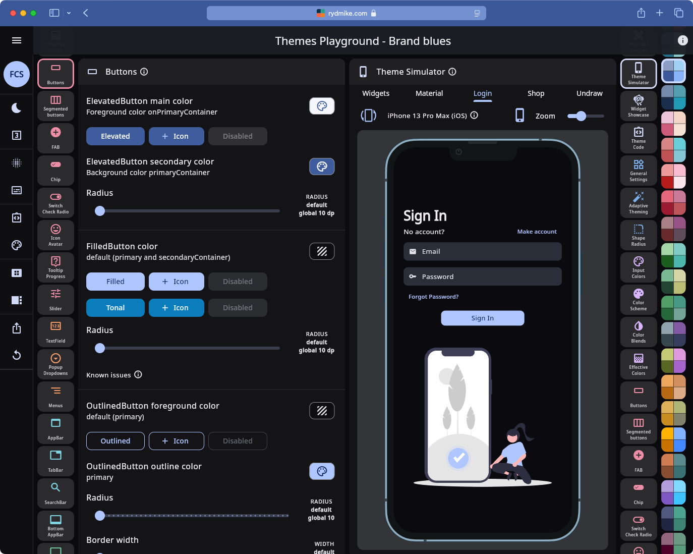
Themes Playground is WYSIWYG Material theme API configurator for the FlexColorScheme package.
FlexColorScheme again, is basically “just” a super advanced and convenient ThemeData factory. You can do anything FlexColorScheme can do with vanilla ThemeData, as FlexColorScheme just returns ThemeData. However, to do some of the things it does may require 2000…3000 LoC of ThemeData config code.
The Themes Playground can generate ColorScheme:s following the Material-3 color system design intent, from just a few input colors, using much more flexible and versatile options than Flutter SDK ColorScheme.fromSeed or the web Google Material theme generator offers.
You can use the built-in schemes, or copy any one of them as starting point for your customized ColorScheme. Seed generation supports multiple seed colors, not just one, like Flutter’s ColorScheme.fromSeed and you can use multiple seed generation strategies with different options. It is all very visual, so you see the results of what you do.
As for what the color roles are intended for, well the Material-3 design guide about the Color System describes it all Color - Material Design 3 - Create personal color schemes
Material components in Flutter map and use these 46 ColorScheme colors for their default values. With component themes in Flutter you can change the color mappings to something else, typically you should still limit yourself to colors in the defined ColorScheme when you change mappings, to keep a consistent color design on all Material widgets.
Thus, put the main colors your app needs into the ColorScheme (46 should be enough), map them as need to components, if default mappings are not to your liking.
If you have very domain specific (not brand) colors, that have semantic meaning in your app, you should consider adding them via theme extensions instead.
The Themes Playground app itself does this for code highlight colors, it then also dynamically tunes these colors to better match the color of the selected/made ambient theme, they still retain their basic color intent, but adjust slightly to fit the selected main (brand if you will) theme. This also a part of Material color tools, called harmonizing your custom colors (colors outside ColorScheme) towards the main active theme color, typically primary color.
As for all the fixed colors in the ColorScheme what are they for? They are a fairly new addition to Flutter, but have existed a while already in Material design spec. Their intent is to provide color variants of primary, secondary and tertiary that do not change between light and dark theme mode. All other colors have different color values in light and dark mode.
Currently no Material-3 components in Flutter map to use the fixed colors by default, but if you want to use them you can change the component mappings in Themes Playground (or manually in your own component themes).
Using one of them on a very important FAB that keeps same color in light and dark mode is one idea, so users always recognize it by the same color.
The guide is very vague about when they should be used Color roles - Material Design 3
So basically more up to you and your own design needs. You can use them e.g. via ColorScheme.of(context).primaryFixed wherever they make sense to you. 
FlexColorScheme and the Playground can generate Fixed colors with higher contrast than the Material-3 design intent default, so they can the also pass the 4.5:1 contrast requirement for text, which the M3 defaults does not do.
If you do not want to use any of the convenience component theming features of FlexColorScheme (Themes Playground a , and just want the massively better ColorScheme generation tools FlexColorScheme uses to generate the ColorScheme dynamically in code rather than copy paste generated const schemes from the Playground, you can check out the FlexSeedScheme package instead flex_seed_scheme | Flutter package