So I usually check the design, analyze what is already a standardized component (buttons, heading, etc.) and what is new for this feature. Let’s say this might be some error card that displays a warning or some other info. It might have various designs depending on some conditions etc. across screens. And what I like to do is check whether I can unify some of these things and if so, I create a “shareable component”.
Maybe in some cases you would just do like 5+ separate widgets, which is not wrong, and maybe it also need some discussion with your designer just to check whether these things on screen are similar by design or just a coincidence. But if that is by design, it’s good to keep them in one place. Why?
- easier to test (it is one component, with different conditions)
- single responsibility
- variants (condition groups for this component)
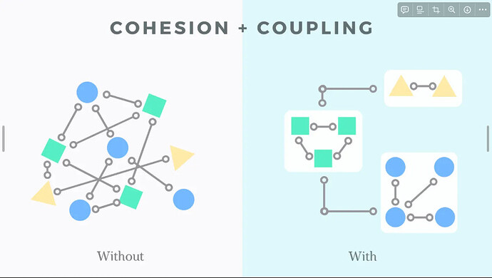
This also help with “Low Coupling, High Cohesion” - which I like to aim for. Maybe even for some stuff like atomic design.
Usually I also ask questions like these, which might help me with deciding whether to merge multiple compoennts to one or not.
- What data does it display?
- How it looks?
- Are there any differences?
How it looks and the differences tell you which variants you have. You can have big/small variants but with the same design otherwise. You might have different colors but the same size. Or both. Or something else. Let’s say I have big/small variant for size, and then success/error/info variant for colors.
Then your initial idea might be to create a factory constructors. BUT I would advice against it. Why?
- nice API
- but does not allow multiple variants together (without matrix hell like .bigSuccess, .bigError, .smallSuccess, .smallError, … - imagine you have 5 types of variants!)
- does not really solve all initialization since in constructor we cannot use context etc.
What I like to do is putting these variants OUT of the widget as enums.
- enhanced enums
- allow multiple variants without matrix (you just have 1 parameter for sizeVariant and other for colorVariant etc.)
- can specify getter methods and there we can use context
- this also keeps all the style differences in one place in favor of separation of concerns (widget build things, variants prepare different stylings)
For an example, if you card padding depends on size/big (size) variant. I put these in part files.
enum SizeVariant {
  big,
  small;

  EdgeInsetsGeometry getCardPadding(BuildContext context) {
    return switch (this) {
      big => EdgeInsets.all(20),
      small => EdgeInsets.all(10),
    };
  }
}
and you widget can be like
class ErrorCard extends StatelessWidget {
  final SizeVariant sizeVariant;
  final String text;

  const ErrorCard({required this.sizeVariant, required this.text});

  @override
  Widget build(BuildContext context) {
    return Container(
      padding: sizeVariant.getCardPadding(context), // here
      child: Text(text),
    );
  }
}
So I find this method very nice, as it separates the concerns, it is clear, and is easy to test and extend.
